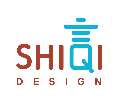
The negative space logo project brief requires the designer to create a logo creatively using negative space by combining two words to form a visually appealing logo. The designer must use the area around and between the words to create an image representing the brand or company. The logo should be simple, memorable, and easily recognizable, and it must accurately reflect the client's brand identity and appeal to the target audience.

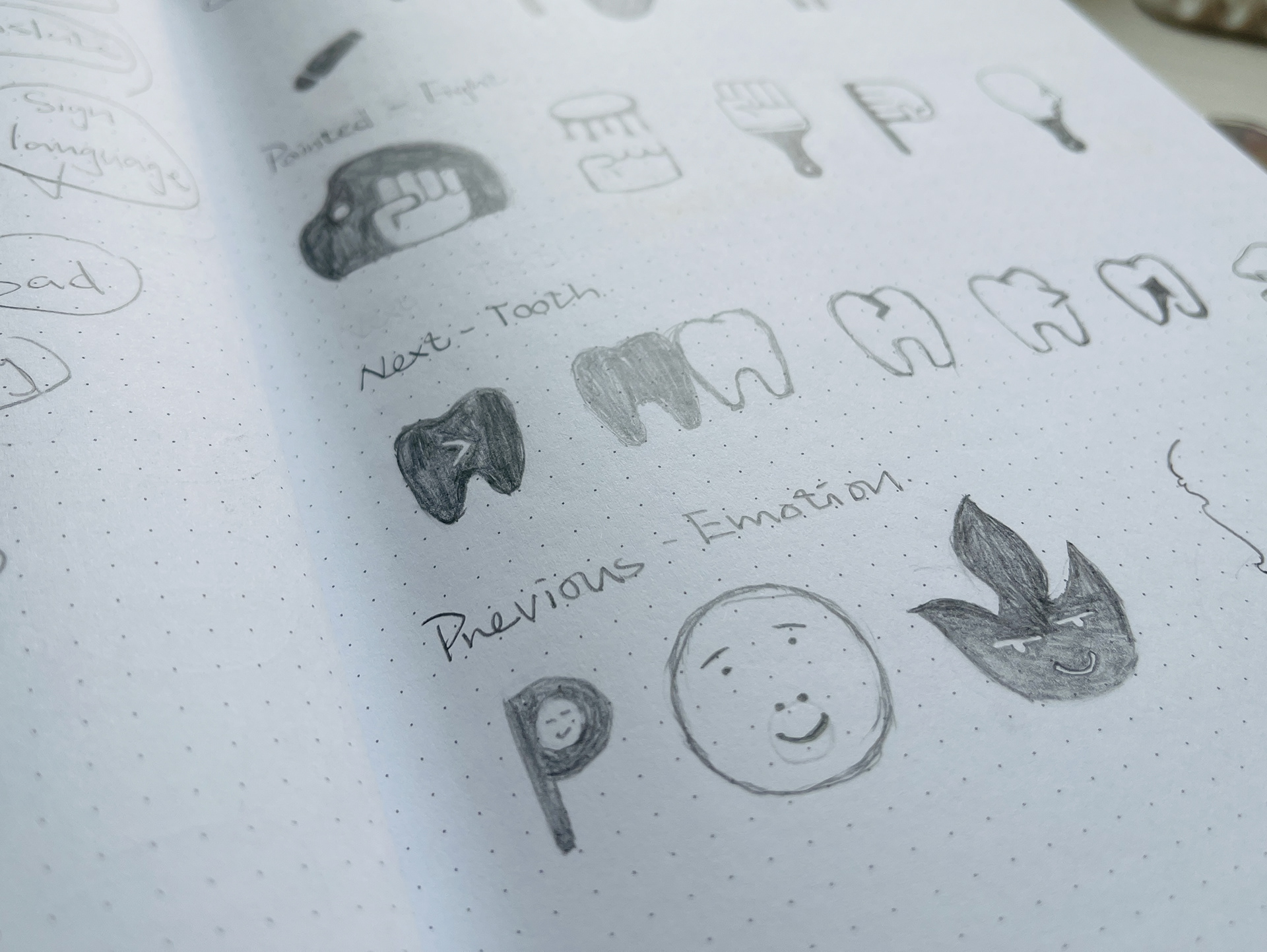
First, it's brainstorming. Generate a list of keywords, phrases, and concepts related to the client's brand to explore ideas for the logo design; This can include both positive and negative space. And then, begin sketching out rough ideas for the logo design, exploring different concepts, and experimenting with using negative space creatively. Next, create digital versions of the refined sketches using design software. This is where I can further refine the design and experiment with various color schemes and layouts. Gather feedback from classmates and make the final icon.
I created digital icons during the WIP stage and explored different design concepts. I experimented with various layouts and colors to incorporate negative space creatively. However, some of my initial design ideas lacked clarity. After receiving feedback from my classmates and instructor, I identified areas where I could improve the design. I considered their suggestions and revised refine the logo further.
The negative space logo project required me to think creatively and outside the box to incorporate negative space into the design. This creative problem-solving skill will be helpful in my future work as a designer. The negative space logo project also taught me valuable skills in layout design. These skills will help create visually striking and practical designs in the future.
